Learn How to Select the Best Colors for the Garden that suit your style, set the mood, and bring out the best in your plants.
You can think of your property as a blank canvas, and plants are the paints you use to create a stunning landscape masterpiece. It’s easy to forget about planting with a colour palette in mind, but whether you’re working in the garden or with containers, colour is what draws the eye, sets the mood, and delivers that “wow” factor you’re after.
Colour brings unity to your garden. It helps you define different spaces, go for a vibrant and wild multicoloured look, or a sleek, monochromatic style. You can use colour to highlight favourite spots or draw attention to a specific focal point. You might hear terms like monochromatic, analogous, complementary, or polychromatic tossed around in colour theory, but don’t let that intimidate you. Keep it simple. The simpler your colour scheme, the more powerful it can be. Pick colours you love and use them confidently throughout your garden.
As you add colour to your outdoor space, here are a few tips to keep in mind.
How to Select the Best Colors for the Garden
1. Select white for shady spaces
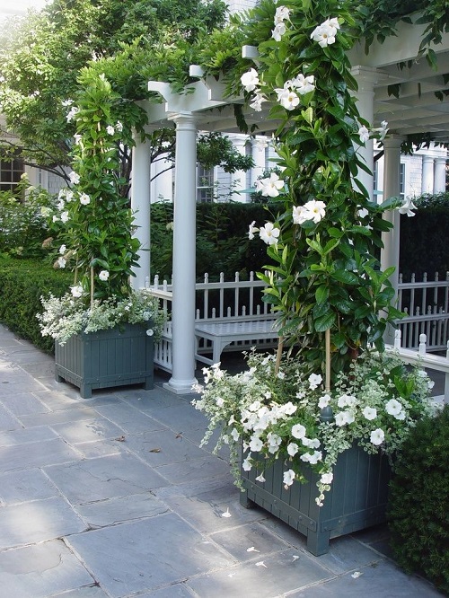
Choose white for shady spaces or a night garden because it lightens dark areas and even casts a glow. White isn’t ideal for full-sun locations because the sunlight will minimize the contrast of the white blooms against the leafy greens—in other words, they’ll lose their pop.
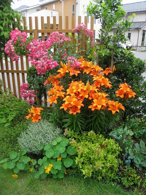
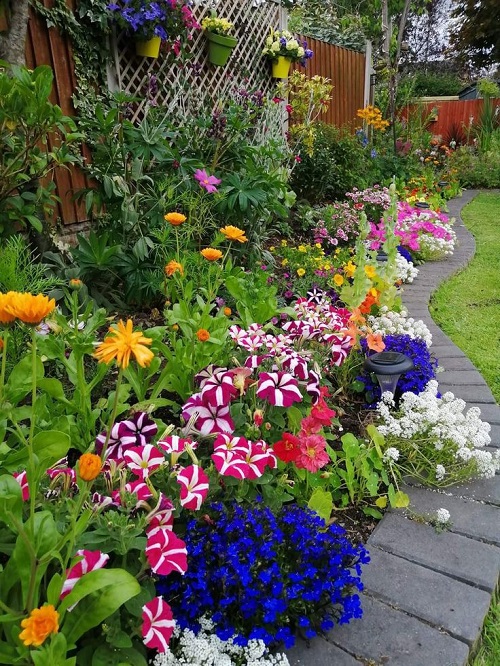
2. Try Bright Hues
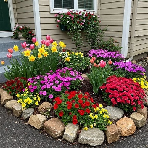
Bright colours like yellow, orange, and red are compelling. They jump out at you, giving the garden energy. Brights like these suit large properties but may be too powerful for a small setting, making it feel even smaller.
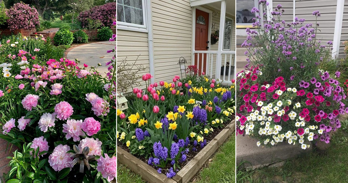
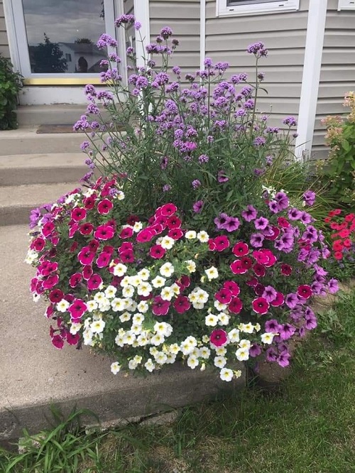
3. Use Soft Shades
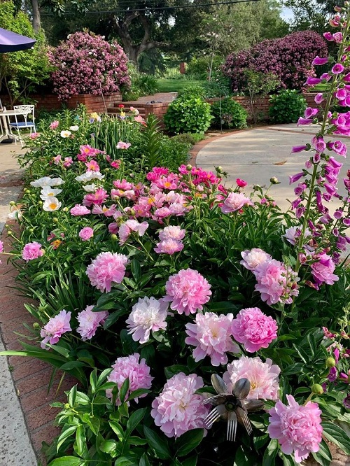
Soft colours and pastels are easy on the eyes and soothing to the soul. They make small spaces feel larger, but can get lost in large landscapes.
4. Plant for impact
You might find it helpful to stick with monochromatic or complementary colour schemes. To keep your garden from overwhelming the eye, try using no more than three contrasting colours in a single bed or container. This keeps things visually balanced and more impactful.
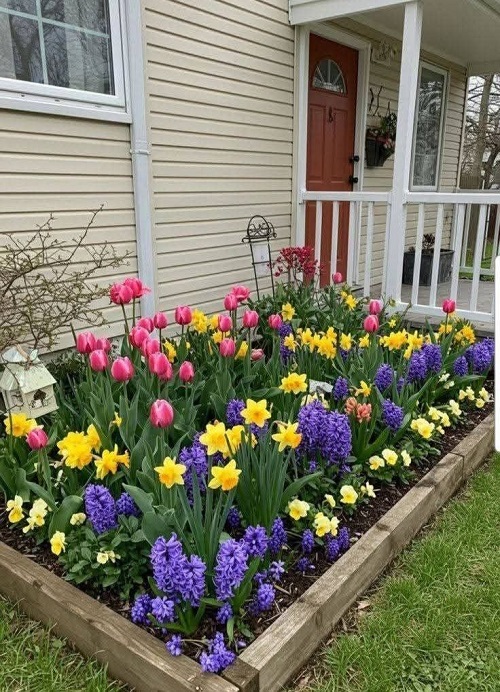
5. Associate colour schemes with seasons.
In early spring, you can fill your garden with yellows and blues—a joyful nod to sunshine and sky. As summer arrives, shift into vibrant oranges and purples for your take on a tropical punch. Come fall, take your cues from Mother Nature by embracing rich tones of orange, red, purple, and copper in your foliage. You can reflect these fiery hues in your container designs too, creating a warm, seasonal display that feels both natural and bold.
Planting According to Colour Theory
Monochromatic
Use of only one colour with differences in shade/saturation, bloom size
and texture.
Plant these: Cherry Tidal Wave petunia, light pink Rocky Mountain geraniums, ‘Black Dragon’ coleus (a mix of reds and pinks)
Complementary
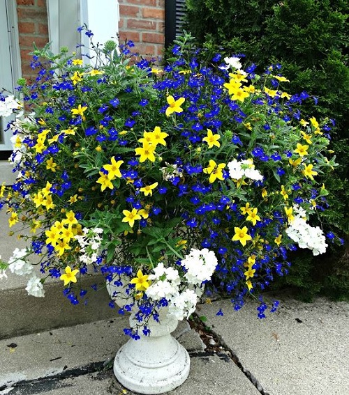
Use of colours opposite each other on the colour wheel.
Plant these: Purple osteospermum, yellow pansies, golden creeping jenny (an ideal early spring container mix)
Analogous
Colours closely related to each other on the colour wheel.
Plant these: Red chrysanthemums and orange pansies (great for fall planting)
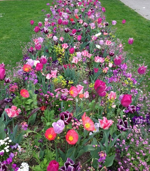
Polychromatic
A fancy way of saying a mixture of many colours.
Plant these: An explosion of perennial colour with blooms like blue delphiniums, pink echinacea, and yellow black-eyed Susans